4 free Google font pairings you need to try

A font embodies so much more than lines and strokes - it evokes a feeling about your brand, to your customer. Selecting the typography for your brand can be achieved when working with a professional designer. However, I understand this might not always be an option.
Google Fonts is a website that provides free font families that you can embed into your website and also download and use on your computer. Gone are the days of having to purchase one font family for $900 (true story!). By using these fonts, you can keep a consistent and professional look across your collateral - from print to digital.
Some typography Tips
1. use 2-3 fonts for your brand
Anymore and it starts to look messy and complicated. A key hero statement font (could be a decorative script used for large quotes or headings) + Heading font + body font. Large amounts of text is generally more legible when it is a sans serif font (like this one).
2. what personality traits do you want to convey for your brand?
Select fonts that support these traits. A serif font with hight contrast can give a formal feel, whilst a sans serif font with rounded corners can give a casual and approachable feel. Also how you use the font - all capitals (for heading) or all lowercase? Is it Bold or does it have added kerning (space between the letters)?
3. support your logomark with complementary fonts
You don’t have to use the exact font that is in your logo. This will keep your logomark unique. Finding complementary fonts will give a cohesive feel - rather than fight with your logomark.
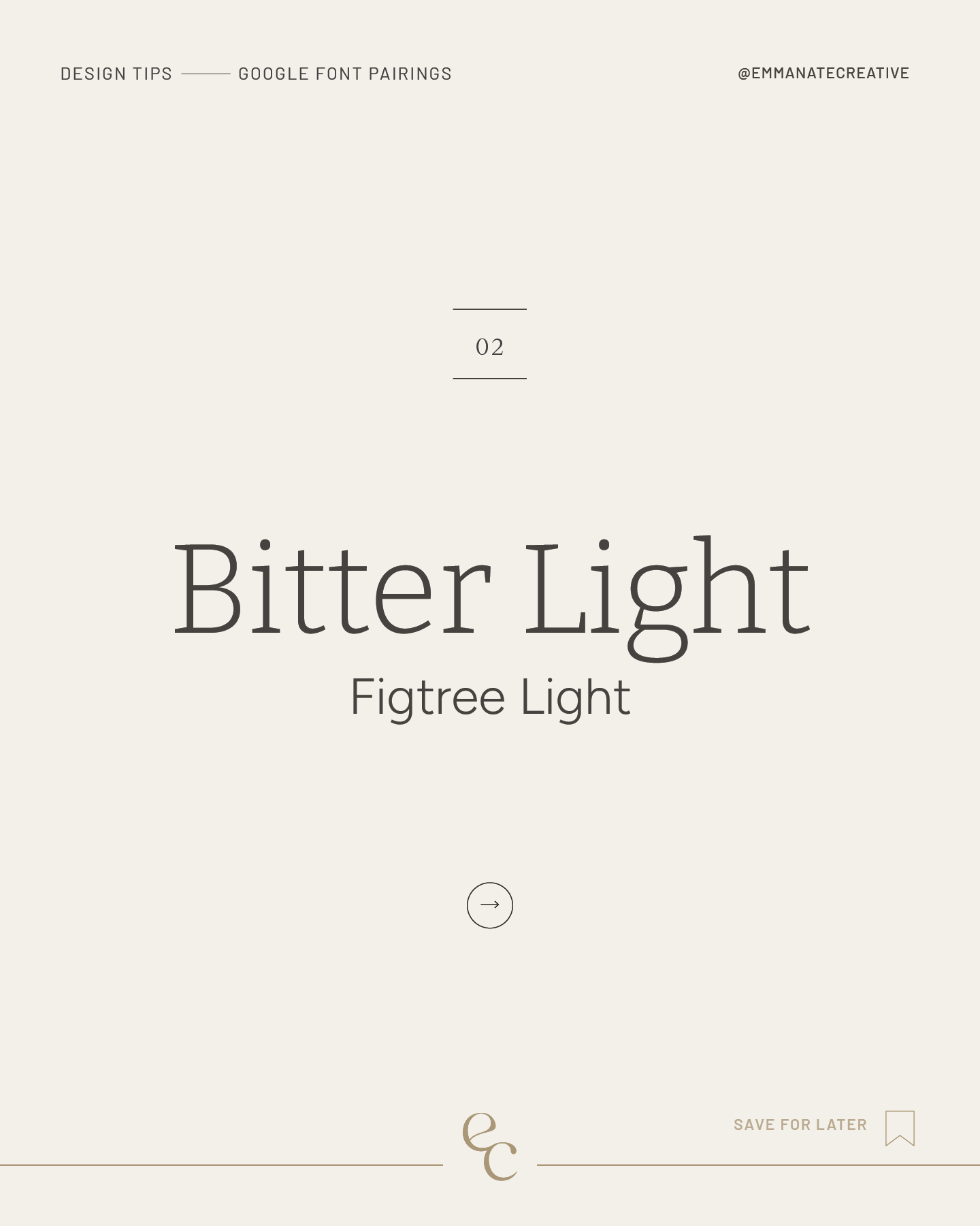
Here are 4 examples of using Google Fonts, that you can see give a unique feel to each example.
YESEVA ONE & RALEWAY
Yeseva One is a decorative serif font which offers a feminine feel, whilst Raleway helps gives this a sophisticated feel (with the decorative ‘W’).
YESEVA ONE >
RALEWAY >
GLEGOO & NUNITO
Glegoo is a friendly and approachable font with slight serifs and Nunito which has slightly rounded ends.
GLEGOO>
NUNITO >
PRATA & ROBOTO
Prata is a decorative serif font supported by Roboto which is a simple vertical sans serif font.
PRATA >
ROBOTO >
GOTU & OPEN SANS
Gotu is a modern and elegant sans serif font with slight contrast in stroke width, matched with the light nature of a sans serif font in Open Sans.
GOTU >
OPEN SANS >