Solstice Fertility
Solstice fertilitiy provides rural & remote women with clarity, care and empowerment through education and awareness around menstrual cycle and bodily autonomy, fertility awareness, natural birth control and optimal conception.
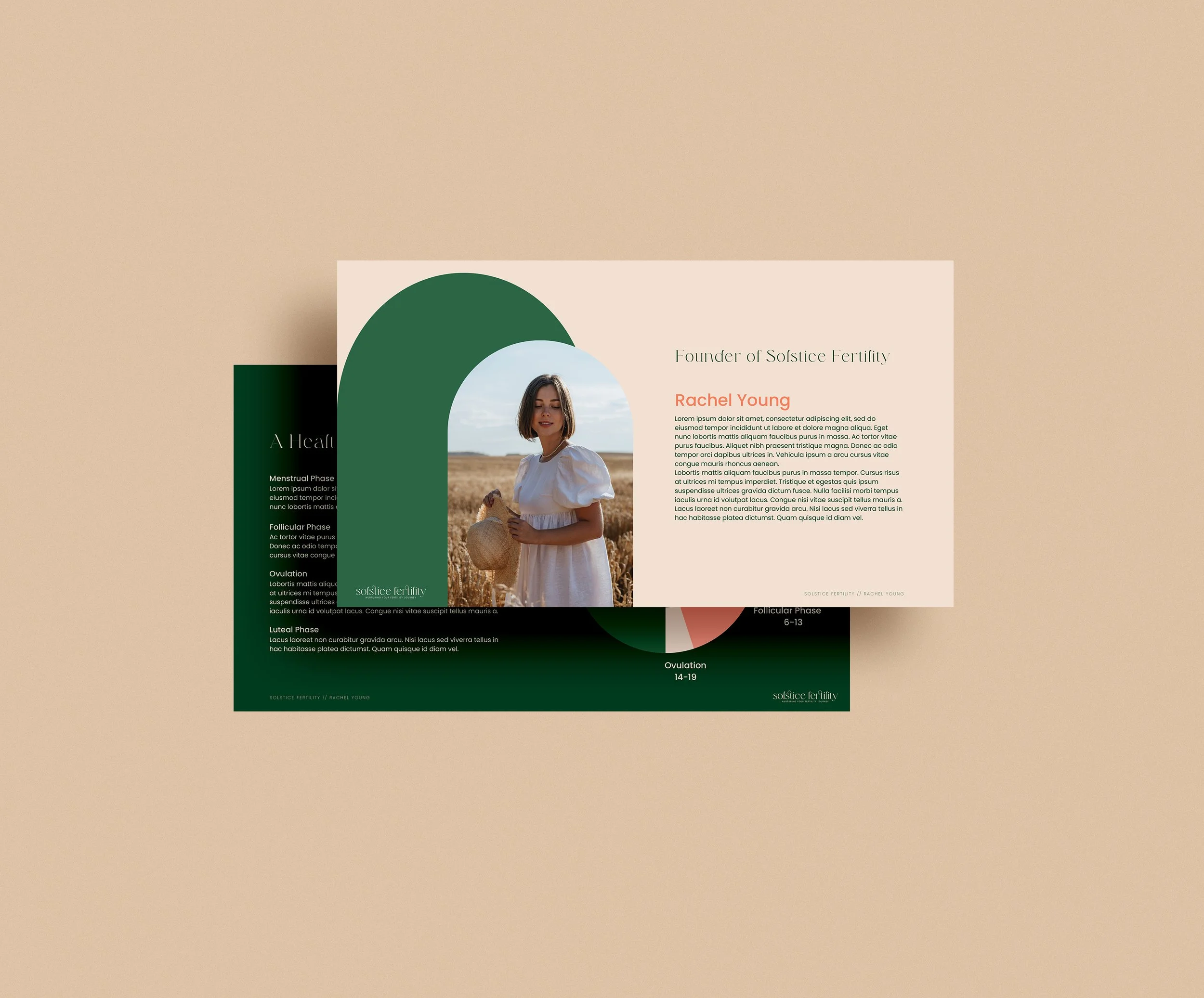
We worked with Rachel from the very early stages of her business conception to help build a brand identity reflective of her new business’s goals. Rachel had a very clear idea of her vision, making the creative process a smooth one. The primary logo has a strong typeface, but with depth and movement that gives it a sophisticated and positive feel. It includes a custom ligature that brings a unique visual element to the word and continues the soft curves.
The rich, floral and botanical colour palette reflects the warmth and femininity of the brand. The deep green represents strength and complements the pinks.
Stationery items, a custom slide deck for client presentations and social templates were created to accompany the roll out of the new branding.